
Signs
The framed logo, colours and typography allow signs to be a visible and consistent part of the Helsinki brand. Signs designed and created well help people find Helsinki’s services, both outside and indoors. Signs created according to the accessibility criteria help everyone move and operate more easily. Visual signs are also useful for individuals speaking different languages.
Main elements in signs:
- Helsinki, Helsingfors or bilingual framed logo
- Helsinki Grotesk Medium font
- black and white colour
- signage icons.
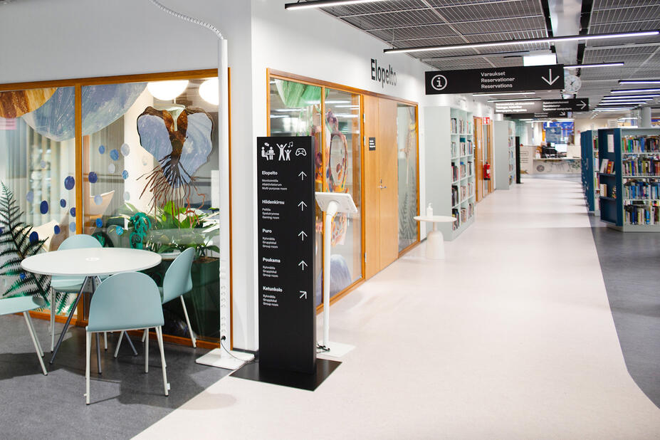
All signs must comply with the City’s language policies. The languages used depend on the operators and visitor target group.
The equal standing of the Finnish and Swedish languages must be taken into account in the City’s public areas. The presence of the Swedish-language logo must be ensured in bilingual and multilingual communications to the residents.
In public spaces, either the bilingual framed logo or the Helsinki and Helsingfors framed logos of equal height, placed sufficiently far apart, must be used. More information on selecting the framed logo

Signs must only use the weight of the Helsinki Grotesk Medium, which is optimal for the purpose.

The colours of black and/or white of the City of Helsinki’s colour palette must, generally, be used in signs. This ensures clarity and readability. The other colours of the palette should be used carefully and with the accessibility requirements in mind.
The materials used in signs are determined according to the building or location. The colours chosen for the graphic elements in signs must have adequate contrast to the background material, in order to ensure accessibility.

Visual information is easier to understand, and it works without any language barriers. Signage icons must be designed according to international standards. Read more about signage icons or download the originals.

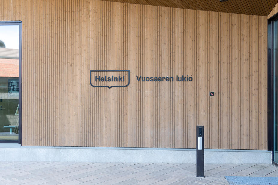
The Helsinki, Helsingfors or bilingual framed logo must be clearly visible on a building’s facade. This will indicate to visitors that the City has operations in the building. The use of the Helsinki framed logo is even more important if a building houses multiple operators. The size of the logo depends on its location and distance from the ground.
A facade may use various means to indicate the operations inside the building: a neon sign, individual letters or decals. Also remember any information screens and flags that are visible outside.
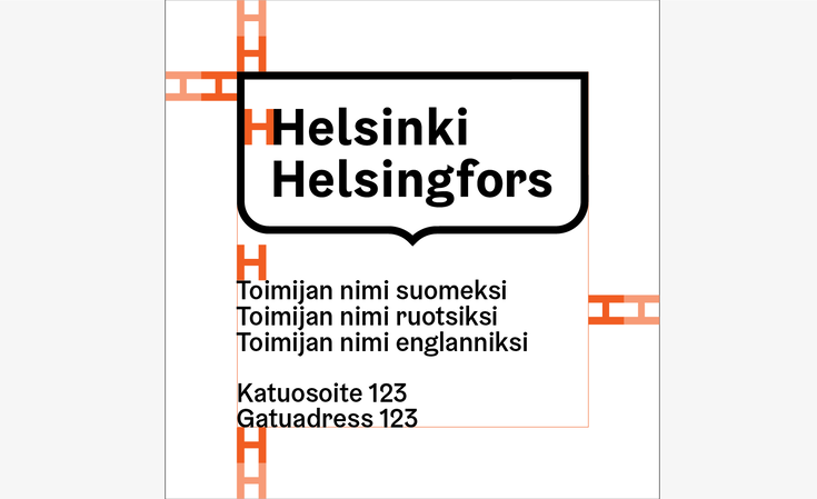
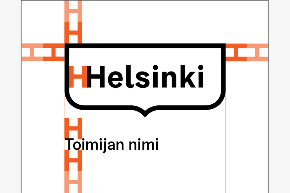
Joint use of typography and signage icons
- With text, in which case the icons must be scaled to match the size of the text (A).
- As separate elements, in which case their size depends on the specifically defined protected area (B, C).
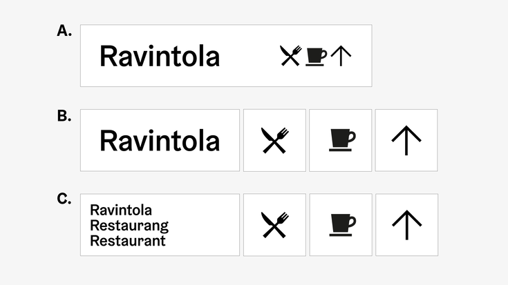
Multilingual arrangement model
- In multilingual signs, different languages must be arranged into separate lines (A, B).
- If a sign contains a considerable amount of text, the different languages can be grouped into separate columns (C).

Main and floor signage of buildings
- A main sign is a more extensive collection of the signage information of an entire building or place. Floor signs contain the signage information of at least one floor.
- The main and floor signs consist of a floor number, signage text and a floor plan.
- The signage elements must be positioned at a sufficient distance from one another. The recommended distance of the elements is based on the protected area of the Helsinki framed logo.
- The size of main and floor signs is determined according to the size and content of the sign surface.
- Alternatively, main and floor signs can also be created by positioning each information element against its own background.


Direction signage
- Direction signs consist of text and signage icons.
- Signage icons may be positioned so that they are part of the text, in which case their size depends on the font sized used.
- In direction signs, text must be placed on the opposite side in relation to where the directional arrow is.
- The size of a direction sign is determined according to the size and content of the sign surface.
- Signage icons in direction signs may also be used against their own backgrounds, separate from any text. In that case, the size of the signage icons is determined according to the protected area specified for them.
- If a text element is separate from the signage icons, the text must always be aligned left.
- If a direction sign is multilingual, each language must be arranged into a separate line.


Room signage
- Room signs are created according to the direction signage principles, aligned left, with each language arranged into a separate line.
- Alternatively, room signs can also be centred.
- The size of a room sign is determined according to the size and content of the sign surface.

Icon signage
These must use the square format and account for the protected area. The size is determined according to the size of the sign surface. The size of icon signs must be in line with the room signs.

Floor number signage
- Floor number signs must use the square format and the floor number must be centred against the background, accounting for the minimum top and bottom margins.
- The size of a floor number sign is determined according to the size and content of the sign surface.

Worksite signage
A worksite sign is the single most important form of communication at a worksite. It describes the project and sources of additional information to the residents.
View the worksite sign guidelines (in Finnish) (Link leads to external service)

Park signage
The guidelines provide a comprehensive description, including templates, arrangement principles, examples, and existing signs and texts. They also include instructions on commissions, visual guidelines and installation.
View the park sign guidelines (PDF, in Finnish)(Link leads to external service)

A flag is an effective and inexpensive way to gain visibility in an urban environment.
Buy, rent or print
- Purchase from Bost’s product catalogue or rent from Stara’s flag service tel. +358 9 310 38941(Link starts a phone call), stara.liputuspalvelu@hel.fi(Link opens default mail program)
- Have a larger number of flags or customised ones printed in accordance with the Visual Identity Guidelines by a contract printing house.
Helsinki flag options available:
- three framed logo versions: Helsinki, Helsingfors, bilingual Helsinki/Helsingfors
- horizontal (250 x 150 cm, for an approx. 9-metre pole) and vertical (140 x 350 cm, for an approx. 9–11-metre pole ). A vertical flag will fly with less wind, while a horizontal one requires stronger winds.
- colour combinations: Metro/Suomenlinna and Coat of Arms/Bus.
A white flag can be used at an event or for another short-term purpose. It must be paired with a colourful theme or event banner. Using a completely black flag is not recommended.
You can request more detailed guidelines on flags from marketing@hel.fi(Link opens default mail program). The guidelines describe the relative proportions of a pole and a flag, the materials, usage purposes and flag group formations.


Helsinki bunting
The size of an individual pennant is 200 x 290 mm, the string length is 10 m, and the print is double-sided. This bunting can be rented or purchased from Bost’s product catalogue or Stara’s flag service.

Visual identity in a space
Colours and shapes are often sufficient tools for creative and interesting physical designs in outdoor and indoor spaces. What type of design solutions could we use to add value to different environments for the residents, emphasising the existing special features of each environment? Or to the materials, surfaces and functions naturally present in a space?
Unshackle yourself from the approach of simply arranging some of the basic visual identity elements onto off-the-shelf structures and templates, ordered from fair catalogues. Anyone can purchase these – every company and the rest of the city. Think of ways to build a future Helsinki with your design. Be different. In addition to being creative, favour options that are environmentally sustainable.
- Could the arches of the framed logo form a skateable shape?
- What could you do with lights?
- Create impressive visuals by making your own cuts of the City’s shared raw video material [link].
- Provide Helsinki’s residents with an event meeting place. See you at Helsinki’s _______!
- Could you build something that can be climbed?
- Create something that activates the residents and your target group.
- Paint or use decals on an existing surface in the environment and create new contrast. Take advantage of existing surfaces creatively.
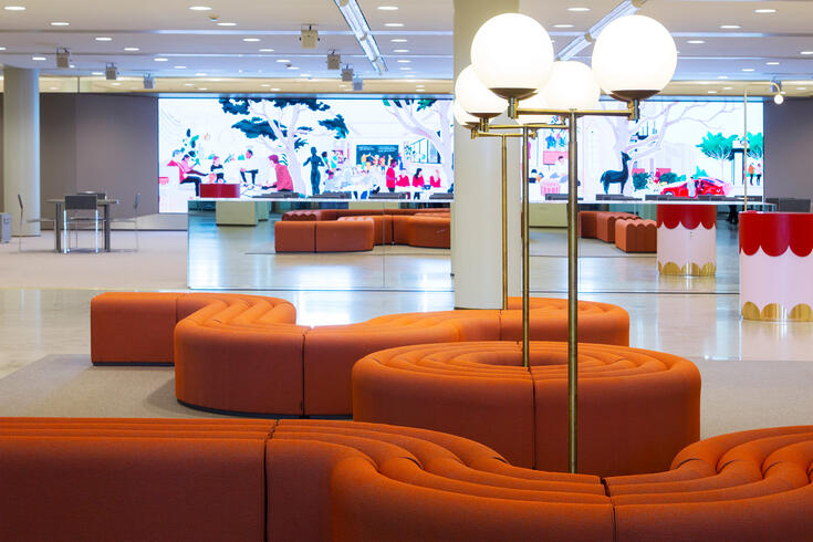


One shared Helsinki. A consistent visual identity has led to a range of coherent designs by various creators, including some used in physical spaces. Elements for different types of outdoor and indoor events that can be utilised creatively. You can read more about the existing event elements shared across the City under the For the City’s employees section, and more extensively about the available material to help you with your design and creation needs in the Download elements section.
A large part of the City’s general image and character is formed by classic pieces of furniture designed for the urban space, the greenery, familiar elements, activities, and the colour palette and materials of the city’s buildings and our environment, such as granite.
History, various eras, new design solutions and the latest innovations all contribute to a profound Helsinki experience.
The content of the manual and the use of the visual identity in a space are on two different levels. One of the main driving forces behind the creation of the visual identity has been the surrounding city and its features. Together, these two provide stability and change.
Commissioning visual communications
The world’s most interesting city brand is being built with a number of framework agreement partners from various fields of creative design and related operations. A good assignment and briefing, as well as the necessary background information and materials, can have a significant impact on how well a collaboration goes, and whether you can achieve your goals in terms of complying with the visual identity, brand and other parameters.
At the start of collaboration
Provide your partner with the City’s shared tools and materials. Ensure that the operator or team is familiar with them.
Framework agreement partners in communications and marketing will be familiarised with the brand and visual identity according to category at the start of their agreement term. You should provide at least the following to everyone involved in creative work:
- A quick video guide to the visual identity(Link leads to external service)
- Helsinki’s brand concept and Visual Identity Guidelines
- Existing materials
Benefits for partners:
Discuss the scope and parameters of the work with the aid of visual material. Creative assignments are difficult to brief in writing or purely verbally.
- Use visual examples to illustrate the desired cohesion and serialism, and existing creations that comply with the visual identity. The material may be physical or consist of screenshots or links to other material that you have gathered into a presentation.
- The julkaisut.hel.fi platform(Link leads to external service) contains plenty of publications from our publication series. They provide examples of the use of the visual identity elements and images, good layouts and data visualisation means in support for words: Annual Report, Personnel Report, City Strategy, theme publications, Helsinki-lehti.
- Share studies and data that could be connected to the work. User and marketing studies, audits, visitor and audience numbers.
- Collect your own visual benchmarks, inspiring images and creations that are successful in your opinion. Describe which aspects in them you find pertinent for the upcoming collaboration: intensity, boldness, insightfulness, simplicity, balance, compliance with the visual identity, funniness, understandability, readability, element of surprise, etc.
- Meet up. At a meeting, you will learn how each of you talks about things and at what level. You can help one another to understand your specific competence areas.

Planning and carrying out creative work involves at least the framework agreement categories listed below, including their subcategories, operators and creators. Discover the categories and the opportunities that they afford.
- Brand management, building and strategic marketing
- Planning, developing and conducting marketing communications
- Social media services, and the strategic design and operative production of social media content
- Graphic and creative design, and production work
- Service design; service and organisation design, digital service design, service environment design
- Video captions and transcriptions
- Media design and acquisition, strategic media design, analytics, understanding customers and measuring
- Printing. Digital printing, offset printing, a rotary printing press and large format printer. Traditional print products, such as publications, calling cards, stickers and large format prints. Service providers also offer storage and mailing services for print products, as well as material processing and layout services.
- Event production. Hybrid event production, physical venues and engaging event content.
- Video production. For a production’s content, and technical and practical creation.
- Communications. Designing, creating and developing communication services, providing consultation and training in communications, and digital communications.
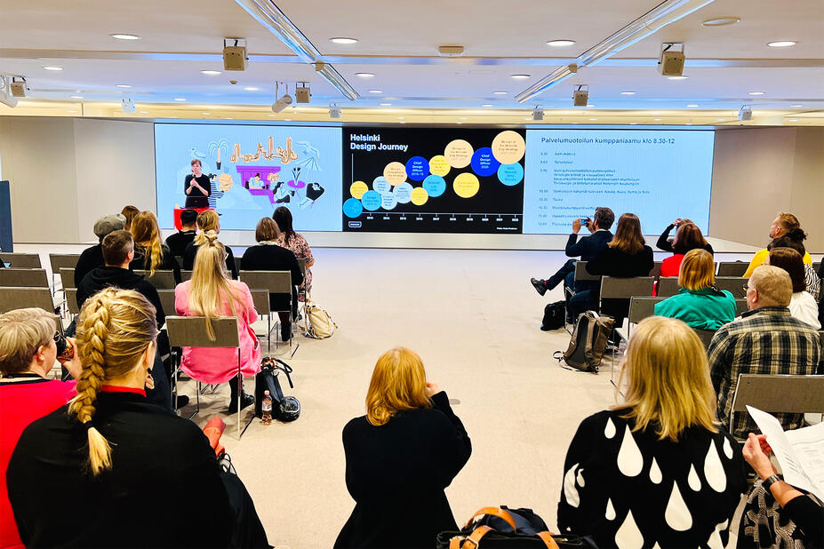
Assignments must be carried out within the visual identity’s parameters. A partner is not expected to add or suggest that something be added to our visual identity, and therefore additions should not be included in their quote. A good visual communications designer understands that creative solutions that comply with the client’s visual identity and brand are possible.
Invest in the idea, content and concept. The visual identity perfects them and the logo serves as a signature.
We highly recommend that all who commission visual communications and work with our visual identity read the Acquisition guide for visual communications (Link leads to external service)published by Grafia (in Finnish).
We hope you enjoy working together!
A good briefing helps an illustrator to give a quote. A briefing is a great way to initiate the work and avoid any misunderstandings or unnecessary work.
You should answer the following questions during the briefing:
-
What are the communication themes/topics and how will the illustrations be used?
-
What are the target groups (the primary target group and other groups)?
-
What is the role of the illustrations?
-
What sort of moods are sought with the illustrations and what kinds of feelings should they evoke?
-
Do you have a preferred style or even a specific artist in mind?
-
How many sets of illustrations will be needed?
-
Describe the content of each illustration required in as much detail as possible (situation, location, season, people, any other wishes or details about the content).
-
Where will the illustrations be used and published?
-
Will the illustrations be animated later? Or, do the illustrations need to be modifiable, so that individual sections can be used for other purposes?
-
Do you have any other preferences regarding the potential applications (e.g. a need for special formats or unusual shapes)?
-
What will the illustrations’ lifecycle be? Is this a short-term campaign or will the illustrations be used for a longer period?
-
What is the deadline for the illustrations; when should the illustrations be available for use?
A checklist for commissioning illustrations
- Agreement: as the client, always sign an agreement with the illustrator regarding the rights to use and publish the illustrations. We recommend that rights for the illustrations are purchased for the entire City organisation for an indefinite period. This allows us to use the illustrations widely and diversely, for example for shared strategic themes.
- Modifying: agree on the modification of the illustrations with the illustrator. In general, it is better that the illustrator makes any modifications, as this will ensure consistent quality. However, modifications by others should also be allowed. Modifying may entail cropping and, potentially, separating individual sections, but not adding anything.
- Originals: the illustrator must submit the originals of the illustrations to the client, who must archive the illustrations for potential future use.
- Distribution: share finished illustrations, creations and illustrators’ details with the entire City organisation via the Teams channel of the visual communications network. Successful illustrations set an example for other operators in the City organisation and help us build a high-quality, contrasted and unique Helsinki brand.
Social media
Design a social media channel that can be recognised to belong to the City of Helsinki. An official channel can be recognised by its name, the about section and profile image.
- Use the logo or a graphic image divided with the wave motifs as the profile image.
- When creating social media content, use images, videos, illustrations, icons or data visualisation that comply with the visual identity. Remember to keep equality, parity, photography consents and accessibility in mind as well.
- The Helsinki Grotesk font is an important communications tool. It lends support to our messages and increases recognition.

Design assistance
Our aim across the entire City is to develop, improve and better manage our visual identity and visual creations.
Do you have any questions about the content of these guidelines? Would you like feedback on your ideas or comments about their practical application? Do you need advice? Have you got ideas for improvement or suggestions on tools and materials to be used by the whole City or a division. Would you like to share your experiences or practices that you have found useful? Are you looking to enhance your skills?
In this section, you can find contact details, useful addresses, tips and frequently asked questions, which we hope will help you with visual communications and the visual identity.
If you have any questions or comments about the guidelines or the visual identity, you can contact graphic specialist Mika Ruusunen from the City Executive Office’s brand and events unit: mika.ruusunen@hel.fi(Link opens default mail program), tel. +358 9 310 37935.
If you have a question about the materials and application of the visual identity in a specific division, the divisions’ own graphic designers can assist you. You can find their contact details under the next section.
Our visual communications creators, graphic specialists and designers also work in the communications teams of the divisions and public enterprises, as well as the City Executive Office’s communications unit. Professionals from various fields of marketing and communications use and develop the visual identity for the needs of their divisions and the city’s residents. They are also in charge of managing the visual identity and take part in visual communication assignments carried out with the framework agreement partners. If you need division-specific help with the visual identity’s application or materials, please contact the divisions’ communications units and their graphic specialists.
Social Services and Health Care Division
Education Division
Urban Environment Division
Culture and Leisure Division
City Executive Office
The Visual Communications Network uses Teams as its main channel(Link leads to external service) (within the City organisation). The most active members online include the City’s graphic designers and communication specialists who work with the visual identity on a daily basis, but anyone interested in visual communications or the City organisation’s employees who are passionate about the topic are warmly welcome to join in! Other motivating factors may also include skill enhancement. Asking questions and seeking answers is allowed. There are no silly questions in the network.
- Operating in various types of networks is an integral part of an expert’s job and a natural way to develop the work further.
- The network is continuously enhanced together with its users.
- The ways in which work is carried out can be improved by openly sharing experiences and practices that are found to be useful.
- One of the important goals of the network is to generate a sense of closeness between people who may be working at a distance from one another and a feeling that they are working towards the same goal.
- The aim of the network is to improve the way that the visual identity is being developed and utilised, and to manage it better.
- The purpose of the Visual Communications Network is to serve as a centralised City-level communication channel in matters pertaining to the visual identity and its practical application. The network shares:
- news about the identity’s development
- questions and advice regarding the identity
- comments and open discussions about work carried out
- information about the current development projects and clarification needs
- tools, presentations and materials
- discussions with the partners about the work carried out
- information.
- The morning meetings with coffee are part of a more extensive support model connected to the visual identity.
- Similar events are held three times a year, in order to reach all new employees who start work at different times during that period.
- The event schedule is planned with the HR department, so that the events take place in the following few weeks after the induction days of new City-level employees and can be advertised at the induction days. Notifications about the events are also posted on the Visual Communications Network, the intranet and this website.
- The next event will take place at the beginning of the year, because we will be welcoming new employees at that time.
- In addition to new employees, the events are intended for all who are interested in our visual identity or work with it, including our communicators, project managers, as well as project and service teams that commission work and applications, compliant with the visual identity, or brief our partners. At these events, you will also hear the latest news about our visual identity.
Graphic guidelines / Visual Identity Guidelines
A set of rules that contain the visual identity policies and instructions on the use of various elements, such as the logo, typography, graphic elements and colours. The criteria defined in the guidelines help with the creation of consistent materials that comply with the visual identity.
Visual identity
The visual identity refers to a systematic, predetermined, instruction-based and recognisable way of creating graphic materials and carrying out visual communications.
Wave motif
Wave motifs are essentially lines, which in heraldry mean an edge of a particular shape. These lines are typically simple and repeated ornamental patterns. Helsinki’s visual identity includes six of such graphic elements, referred to as wave motifs (Basic, Calm, Pulse, Beat, Vibration and Wave). They are used in accordance with the visual guidelines to divide surfaces on various media.
Icon (also pictogram)
Simplified images that all have a specific meaning and have been designed for the visual identity. They are used either with or without a text description. Icons have been designed for three purposes: signage icons, user interface icons and illustrative icons.
Brand
A brand means the associations linked to a product, trademark, company or other operator, and it is the sum of an image and reputation. A brand can be impacted through visual appearance, narrative and business culture, among other things.
Helsinki framed logo
A logo that consists of the word Helsinki and is surrounded by a frame shape derived from the City of Helsinki’s coat of arms.
Pride
Pride refers to a movement and a philosophy, according to which sexual and gender minorities can be proud of their sexual orientation and gender identity. The Pride movement defends the work carried out for sexual and gender minorities’ equal rights and interests.
Logo wallpaper / Logo wall
A surface onto which logos have been arranged. Can be used in expo stalls or as a photoshoot background, for example.
Drop shadow
A drop shadow is a shadow that an entity casts on its surrounding. They are used in computer graphics to increase the three-dimensionality of an element. One common use is with user interface buttons.
Glow
An effect that forms a glowing edge around an element.
3D
Three-dimensional graphics are a form of computer graphics modelled around the three spatial dimensions.
Heraldic
Heraldry is the study of flags and coats of arms. Heraldic symbols are designed according to strictly defined criteria. Similarly, the use and arrangement of coats of arms are governed by systematic rules.
Vector graphics
Vector graphics means images (graphics) whose parts are defined as mathematical expressions. In this format, images/graphics take up little storage space and can be scaled up without reducing the image quality. The format is typically used for logos, symbols and icons.
Vector originals / Vector format
Vector graphics are often transformed on websites into bitmap images, which consist of pixels. A vector original means the original image in vector format.
Font
A group of characters designed to be uniform in appearance that often consists of letters, numbers, punctuation and symbols. One example of a font is Arial. The terminology varies, but the word ‘font’ is sometimes used to mean a single font style, while in other contexts it refers to an entire font family.
Style
Specific versions of a font, for example, Helsinki Grotesk Medium or Arial Light.
Font family
A set of styles that are part of the same font. At its smallest, a font family consists of Regular, Bold and Italic styles, but an extensive font family may include dozens of them.
Arial
A sans-serif font that is included in both Microsoft Windows and Apple Mac OS X operating systems. As it is so widely used, Arial is a so-called web safe font, meaning that all users are expected to have it.
Helsinki Grotesk
A licenced (paid) font tailored to Helsinki. It is a sans-serif font available in four weights, Regular, Medium, Bold and Black. Each of these also has its italic version.
Licenced
A software creator grants a right to use their program, i.e. a licence, in exchange for money. The font licences and their installation to the City’s work stations are managed by the ICT/Digitaalinen perusta. Subcontractors must acquire a licence directly from the creator.
Regular
A basic font style typically used for body text.
Bold
A thick font weight that can be used in the body to highlight words, in headings or when a style stronger than Regular is required.
Italic
A cursive style based on handwriting that is used to highlight elements in a text. It can be used to emphasise words, set names apart from the surrounding text and indicate quotes instead of quotation marks.
Black
The boldest style of the Helsinki Grotesk font. It is unsuitable for longer texts due to readability reasons, but it can be used to create powerful headings and pull quotes.
Office software / Microsoft 365
Productivity software developed by Microsoft for Windows and Mac OS X operating systems. It includes the Excel, PowerPoint, Word, Outlook and OneDrive applications, for example. The use of the product name Office has become less common since the launch of the Microsoft 365 subscription service.
Word
A text editor created by Microsoft.
Excel
A spreadsheet program created by Microsoft.
PowerPoint
A presentation graphics program created by Microsoft.
DigiHelsinki
DigiHelsinki Oy is a subsidiary fully owned by the City that develops, produces and sells infrastructure and basic IT services for the divisions, public enterprises and other City operators. Functioning IT services are critically important for the entire City’s operations.
Text hierarchy
Publications consist of different types of textual sections, each of which has its specific purpose. These include titles, lead paragraphs, body text, pull quotes and captions, to name a few. A clear hierarchy between different text sections helps readers interpret the text correctly.
Body
The main text section of a publication. Usually, the body contains the majority of the text.
CMYK
A colour system that is often used for print products (four-colour printing). The acronym comes from the words Cyan, Magenta, Yellow and Key (black).
Coated and uncoated paper
The paper used for print products is typically divided into coated (C) and uncoated (U) types. Both types have their specific characteristics, which should be considered based on the intended use. Different colour profiles are used with different types of paper. Colours and images are also rendered differently on different paper types.
Pantone colour / PMS colour / spot colour
The Pantone Matching System (PMS) is a printing industry colour system. The colours are ready-mixed inks used instead of or in addition to process colours (CMYK). Pantone colours are identified by the ordinal numbers assigned to each one, illustrated in the PMS colour chart. Some colours cannot be produced by using the CMYK system, but Pantone colours allow the colour rendering of print products to be expanded.
RGB / HEX
A colour model in which colours are mixed by combining red (R), green (G) and blue (B) light. Each colour is assigned a set of numbers that indicate the amount of each primary colour in the mixture. On a website, this value is expressed by using a hexadecimal number consisting of six digits or letters (HEX value). The RGB colour model is used to display colours on computer screens, for example.
Colour model
A colour model is a means of describing and categorising colours. It also refers to colour samples that are used to help with the colour selection. Examples of these models include Pantone, RAL and Tikkurila’s colour models and swatches.
RAL paints
The RAL colour system (RAL colours) is a standard created and maintained by the RAL institute. The system is used by industry, in particular, to define the colours of paints, plastics and various surface materials.
Foil printing
Traditional foil printing is a process in which a special effect, consisting of a thin sheet of metal, is attached to the surface of a print product. These days, foil printing is also possible in digital printing.
Metallic colour
A metallic treatment that is used in print products that mimics various metals (e.g. gold, silver or copper) or combined with a colour. The printing material may also already have a metallic sheen. These days, metallic colours are also available for digital prints.
Helsinki Design System / HDS
A design and development tool(Link leads to external service) that promotes the ease of use, accessibility and general appearance of the City’s digital services and platforms.
ASE
Adobe Swatch Exchange (.ase) is a file format used to share colours and colour palettes between Adobe’s graphic software.
Value
A colour definition indicated in numbers. In different colour systems, values mean different things. In the RGB system, values can also be stated with a hexadecimal number (HEX value) that consists of six digits and letters. The values of colour systems are normally not absolute. Instead, the final colour depends on the colour space that a colour is used in (ICC profile). An exception to this are the Lab values, which can be considered to be absolute.
Colour space
A colour space encompasses all those colours that can be rendered by using a specific colour model. It can be used to define colours exactly and render them in different environments.
ICC profile
A standardised description of the colour space of a device, included in the image files. It includes colour definitions for graphics software, and distributes data between software and peripherals, such as monitors, printers and scanners.
Colour component
The individual colours that form a colour system are called colour components. The intensity of a colour can be reduced by reducing the amount of a component. For example, the 30% partial intensity of black makes a light grey.
Accessibility
The aim of
accessibility(Link leads to external service) is for everyone to be able to use and interpret the content of online services and mobile applications in any given situation. In order to achieve this, the usability of digital services and applications must be designed with the needs of special groups in mind. The Act on the Provision of Digital Services defines the minimum level for the accessibility of online services.
Accessibility
Accessibility(Link leads to external service) traditionally means that all people are taken into account when it comes to the physical environment, including the design and construction of built environments. For example, accessible buildings and accessible public transport allow people with disabilities to work, take part in hobbies and enjoy culture. The European Accessibility Act specifies which government or private sector services and products must be made accessible.
Alt-text / Alternative text
The Act on the Provision of Digital Services requires that alternative text options be provided for all non-textual online content. Screen readers read out the text versions of content to individuals who cannot see visual content.
Alt-text (Link leads to external service)is also useful when a user’s browser is unable to load an image for some reason, allowing the user to see the alternative text instead.
Assistive technology
A program or a device with which people with disabilities can use digital content. Assistive technologies include software installed on a user’s computer, such as a screen magnifier or a screen reader, or separate devices, such as switch controls.
Design for all / Universal design
A user-centred approach that bases the designs of services or the built environment on accessibility that is as comprehensive as possible, instead of creating adapted versions for different user groups.
PDF
The acronym stands for Portable Document Format. PDF is a software-independent, transferrable file format based on the PostScript language that is mainly used for electronic publications, printouts and prints. Fonts, bitmap and vector images, multimedia files (e.g. sound and video) and hyperlinks can be added to PDFs. A PDF can consist of either pixel or vector graphics.
SVG
The Scalable Vector Graphics (SVG) is a file format that is suitable for the internet and used for vector images. Its important features include scalability and the ability to save text data as letters rather than shapes. This has an effect on search engine visibility and accessibility, among other things.
PNG
The Portable Network Graphics (PNG) is a raster graphics format that supports lossless data compression. PNG files are commonly used to save the graphics of web images. It supports partial or full transparency, which means that the background colour of the graphics can be removed.
Brand concept
A brand’s concept design is a concentrated vision of how the brand will be visible in services, products, marketing and customer experience.
Scalability
Elements whose size can be changed without it having an effect on the resolution are called scalable. Examples of such elements include vector graphics and text.
Screenshot
A screenshot is a pixel image captured from the content on a computer, smart device or tablet.
Repeated pattern
A graphic shape or image that can be seamlessly repeated either horizontally or vertically.
Audit
An audit is a systematic assessment of how well an organisation’s operations and the related output match the expectations and plans. Audits can be either internal or external. External audits are formal and independent (e.g. ISO certificates require auditing).
Benchmarking / Comparison analysis
Refers to a comparison between an operator’s own operations and the operations of others, often a practice that is the best possible match. The idea is to learn from others and question your own operations, allowing the operations to be further improved.
Hybrid event
A combination of a virtual event and a live one. The participants can choose whether to take part via a computer or a mobile device, or whether to attend physically.
Strategic marketing
A market-centred way of thinking forms the foundation for competence in strategic marketing. Its emphasis lies on observing the clients’ needs, and having the ability to create products and services based on the needs identified.
Digital printing
Digital printing is a technique in which elements are printed on paper directly from a digital source. This technique is used, in particular, for printing smaller series and bespoke print products. Digital printing is the most ecological printing method, especially when it comes to smaller printing volumes. The City Executive Office has its own digital print press. More information is available via the City’s intranet.
Offset printing
A printing method in which a printing plate leaves a print on a rubber cylinder, which transfers it onwards onto paper. It is the most commonly used printing method, but is becoming less used (due to digital printing).
Briefing
A meeting during which the client of a commission explains or otherwise conveys the goals, criteria and other information that effect the design work to the designers, and where the schedule and submission of materials are discussed.
Visual communications
A form of communications that emphasises various visual ways of conveying information (instead of or in addition to written text). Possible means include animation, video, illustrative images or infographics, to name a few. Text formatting and typography are also an important part of visual communications.
Visual identity of digital services
One shared Helsinki also serves as guidelines for designing the visual appearance of digital services. The aim is that digital services and webpages can be recognised as the City of Helsinki’s services at first glance. This enhances a consistent user experience and trust in the City’s services.
Helsinki’s way of developing digital services is agile and customer-centred. The digital customer experience playbook contains the main guides and instructions for the development of digital services. The playbook also provides you with support in utilising service design in the creation of digital services and websites.
The playbook offers the following, for example:
- support with running a digital service design project and further developing this process at various stages
- the best practices for customer surveys and digital services’ user testing
- practical advice on user-centred content design and tone of voice.
Discover the digital customer experience playbook(Link leads to external service) (in Finnish)
Helsinki Design System (HDS) is a design and development tool that promotes the ease of use, accessibility and general appearance of the City’s digital services and platforms. Service designers can focus on identifying the customer needs and improving the customer experience, as they no longer have to create all functionalities themselves from scratch.
The Helsinki Design System documentation site contains the following, for example:
- basic building blocks of a digital service
- design guidelines to ensure accessibility
- ready-made and accessible components for designers and software developers
- read-made and accessible design models to ensure consistent user experience.
Discover the Helsinki Design System(Link leads to external service)
Work has been carried out since 2020 to harmonise the visual appearance of the City’s website as part of the channel policies and the hel.fi regeneration project. The City’s website, i.e. hel.fi, has been built on the Drupal and WordPress platforms.
- Our main site is being created on Drupal, which has a diverse range of page templates and other visual identity building blocks.
- It will be easy to create new pages on the City’s Drupal platform, and, under certain special circumstances, a new Drupal site can be created with the help of a basic installation package that adheres to the brand.
- A Helsinki theme is available for campaign sites and other special cases on the WordPress platform, and the theme makes it easy to establish a website that complies with the brand.
The visual appearance of our websites is based on the City’s visual identity and Helsinki Design System guidelines, but the visual concept and policies are more detailed for websites.
- A specific number of colours and colour combinations have been selected for websites from the City’s colour palette, and they are accessible and comply with the concept.
- The hel.fi website changes according to the season. The changing seasonal themes include images, illustrations and colour themes chosen for the front page.
- The use of photographs and illustrations on the site is also governed by more detailed guidelines. We showcase daily Helsinki and the good everyday life of its residents: people, shared activities, joy and funny details. The images show people of different ages and backgrounds. Instead of illustrations, all cover images use photographs.
It is important that everyone involved in user interface design for the City joins the City’s UX network. The aim of the City’s joint UX network is to harmonise the UX operations towards a consistent customer experience in the City’s digital services and on its websites. All UX designers working for the City are invited to the City’s UX Review, held every other week (on Teams).
A checklist for a new user interface designer:
- You will need to have access to the City’s font package and credentials for the design tools.
- Request access to the City’s Slack and the main design channels (UX Review and designsystem).
- Request a calendar invitation and verify your participation in the City’s UX network.
Accessibility and equal communications
Accessibility is about justice and equality in digital services.
- All the shared user interface solutions of hel.fi have been made accessible (WCAG 2.1 AA).
- The site uses images and terminology that take diversity and equality into account.
Read more about Helsinki’s accessibility model(Link leads to external service)
Completion of this section is pending .
View the Helsinki for All guidelines(Link leads to external service)
For the City’s employees
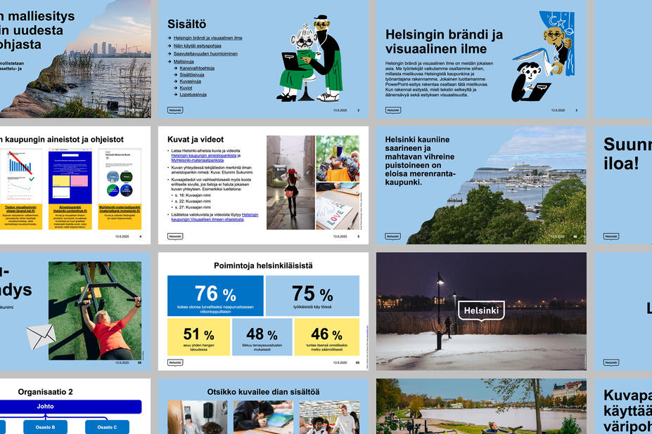
In addition to these guidelines, information, instructions and material has been put together on the intranet and in our material banks for the City’s employees. The work stations have been equipped with Microsoft 365 (formerly Office) applications, whose functions we use for work, and to organise, share and create new things.
- PowerPoint templates that comply with the visual identity. A basic and an extensive template(Link leads to external service)
- Ready-to-use presentations(Link leads to external service) from which you can choose material, such as the City’s shared content, illustrations [an internal link in the guidelines to ready-to-use illustrations shared across the City], photographs and infographics.
- Consider the visual appearance of your presentation. Only use a few different slide templates in one presentation, even though plenty of options are available. Let the viewers rest their eyes a while on images and pull quotes. Avoid an end result that is too topsy-turvy. Aim for a coherent whole.
- Create presentation slides to support an oral presentation. Add rhythm to your presentation with slides that only contain a heading or a section, a photograph that fills the entire slide, a few words that describe the gist of your speech and relevant pull quotes. Do not write out everything you intend to say.
- If you plan on sending out your presentation rather than giving it orally, you can design it differently. Think of the presentation as a publication, which has a cover page, headings, various sections and images that are logical in terms of their hierarchy and repeated throughout the presentation.
- If you plan to give a presentation on Teams, think about the things that your audience will look at while you speak and for how long. You can activate remote viewers with pull quotes and images, leading your audience through your presentation.
- Selecting the New menu on Word opens the jaetut (‘shared’) folder, where you can find Word templates compliant with the visual identity for various purposes. Their layouts and text sizes have been predetermined.
- Other materials that comply with the guidelines and can be edited on Word include:
- Name badge templates for event organisers, participants and other personnel. You can autoflow the information for name badges directly from Excel if you have a lot of participants. The instructions can be found with the templates. [an internal link in the guidelines to the Download elements section]
- Place card templates for various occasions, negotiations and open meetings. [an internal link in the guidelines to the Download elements section]
- You can find Helsinki backgrounds in the Teams default background image menu on your work computer (bottom of the list).
- A range of backgrounds have been designed for various types of meetings and get-togethers: coffee with colleagues, internal weekly meetings and external meetings with representatives of other organisations.
- Choose a suitable background according to the lighting, and the tones and contrasts of the person’s hair, skin and clothes. Instructions on using backgrounds(Link leads to external service) (in Finnish)
- The backgrounds include changing Helsinki-themed photographs that are added systematically to the application based on the season and pictures that are otherwise new.