Useful downloads for creating and designing visualisations:
- Examples of finished visualisations from the visualisation scrapbook (PDF)(Link leads to external service), containing a variety of graphics using different visual solutions.
- Colour palettes and other style definitions are included in the City’s Office themes.
- For professional design software you can download colour palettes here(Link leads to external service) and Illustrator-templates here.
Structure of the guide:
Introduction to visualising information
The City of Helsinki has created its own house style for information graphics, which follows the general visual identity of the city. The necessary colour palettes and other style settings can be found in the city’s Office templates. This summary provides guidance on choosing the right chart type for the most common use cases, and on how to use colour in visualisations.
More instructions are found in the detailed guidelines, following this brief overview. The links herein also refer to the more in-depth instructions.
Examples of finished visualisations can be found in the visualisation scrapbook(Link leads to external service), containing a variety of graphics using different visual solutions.
The introduction includes the following sections:
- Choosing the right visualisation for the most common situations
- Basics of using colours in visualisations
Detailed guidelines
Choosing the right visualisation for the most common situations
What follows are some rules of thumb for choosing a suitable chart type for the most common use cases you may encounter.
The guidelines concern visualising quantitative data, meaning numerical information. Visualising non-numerical qualitative information is discussed in the detailed guidelines.
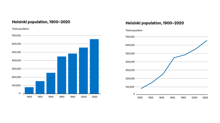
Does the data have a temporal dimension, does it for instance show a numerical value per year, month, or week? If so, the data forms a time series, which is best visualised with either a line chart or a vertical column chart. The bar chart emphasises the values of individual data points and better enables comparisons between these, while the line chart highlights the direction and relative rates of changes in the data.

Does the data show the division of a whole into parts? A single whole divided into parts as a percentage distribution is usually visualised with a pie or donut chart. If separate distributions are to be compared side-by-side, the 100% stacked bar chart is preferred.
Note that a percentage distribution must add up to 100%. If adding the percentages for the component categories together produces a sum that is much larger or smaller than 100%, the data in question is not a division of a whole into parts, but separate percentage values that may be visualised with a horizontal bar chart.

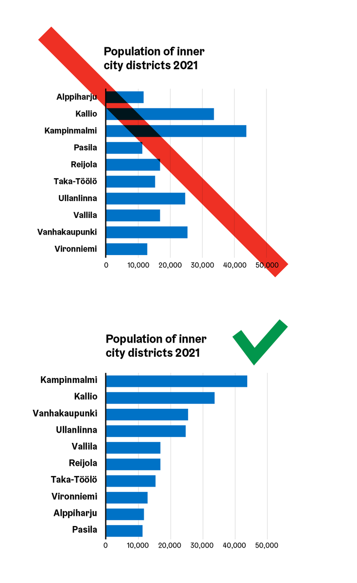
Are numerical values being compared? If the data is neither a time series nor a percentage distribution, the most suitable choice is usually a horizontal bar chart. The bars in a horizontal bar chart should usually be sorted by value from the highest to the lowest.
The individual values of the bars may be marked with data labels directly on the bars, in which case gridlines may be omitted.

If the purpose is to show and emphasize separate, interesting values without specific comparisons, big numbers or pictorial unit charts can be used.

Basics on using colour in visualisations
Colour has two functions in visualisations: in some types of visualisations, such as choropleth maps, colour is used to represent numerical values. However, in line, bar, and pie charts, along with other common visualisation types, the function of colour is usually to help the reader distinguish between elements belonging to different series, that is, identifying categories in the data. Series are the different individual lines in a line chart, the slices that make up a pie or donut chart, and in other chart types – for example, in a stacked or clustered column chart – those elements that use the same fill colour. (In a standard bar chart, there is only one series, so the colour is not used to distinguish between series.)
When choosing the colours for the data series, please note that the colours used must comply with the city’s brand guidelines(Link leads to external service) and the accessibility requirements of the Digital Services Act. Not all the city brand colours can be used together in visualisations, as some of the colour pairs are difficult to distinguish for people with differences in colour vision, or in everyday language “colour blindness”.
For accessibility reasons, dark outline colours are also to be used around coloured areas in graphics. The best results are usually achieved when visualisations are made using the city’s predefined Office templates, where charts are defined with fill and border colours that meet these conditions.
The following image shows three palettes featuring the city’s brand colours. The upper row shows the colours in their original form, while the lower row simulates how the colours may appear to a viewer with deuteranopic colour vision. The palette on the left is one of the qualitative palettes for visualisations created for the city. It has a good separation of colours even with simulated deuteranopia.
The colours in the middle palette are too close to each other in terms of darkness, making it difficult to distinguish between the element outlines. In the rightmost palette, the blocks are distinguishable in the original version, but in the deuteranopia simulation some of the hues are visually too similar.
