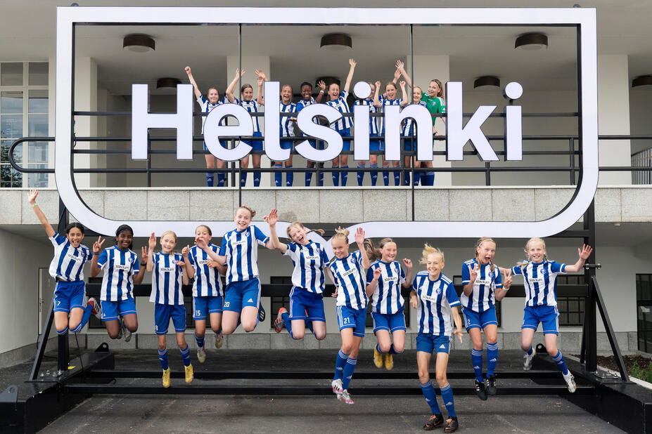
Helsinki framed logo (Helsinki logo)
The Helsinki framed logo (Helsinki logo) consists of the word Helsinki that is surrounded by a frame shape derived from the City of Helsinki’s coat of arms. The logo has specific dimensions and arrangement rules, and it serves as Helsinki’s official logo. Helsinki logo has been registered as a trademark. Download the originals here.
- Helsinki logo is mainly used as a black or a white version.
- Always use the original logo files.
- You may not try to re-create or modify the logo yourself.


In global marketing, it may be necessary to indicate Helsinki’s geographical location. The Helsinki Finland framed logo version may be used for that purpose.
Pride-themed versions of the framed logo are also available.

Several factors affect the choice of language version: where is the logo used and which target group is it intended for?
As a rule of thumb:
- The Helsinki framed logo is used in Finnish-language, English-language and international contexts and materials.
- The Helsingfors framed logo is used in Swedish-language contexts and materials.
- The presence of the Swedish-language framed logo must be ensured in bilingual and multilingual communications to the residents. This includes contexts in which communications are intended for the City’s residents, regardless of the communication channel, for example, in public spaces or indoors, such as at resident events, in signage or in the form of instructions.
In that case, either the bilingual framed logo or the Helsinki and Helsingfors framed logos of equal height, placed sufficiently far apart, must be used.
A public space or area is a place that is open to all and that anyone may enter without asking for permission. Government agencies, as well as libraries, parks and squares maintained by the cities, are public places. Also, streets are public.
In addition to Finnish and Swedish, the Helsinki framed logo is available in several other languages. These language versions can be used in contexts and materials that are in those specific languages.
One view – one logo
Helsinki uses its logo to sign contexts, materials and facilities. For the sake of clarity, a view may only include one logo version at a time. A view refers to the entity that a person can see in a specific situation or from a specific location.
For example, views include the following:
- Left and right side
- Front and back side
- Different times, e.g. in moving images
- Sufficient physical distance (approximately five metres, depending on the case).
Exceptional applications include the background logo panels in interviews, in which the logo is a graphic element.

Examples of using the logo language versions together
- Incorrect. A view may only include one framed logo. Example size A4.
- Correct. A bilingual framed logo in a single view. Example size A4.
- Correct. Two framed logos on different sides or in different views. For example, a wall of a building.
- Correct. A bilingual logo in a single view or on one side. For example, a wall of a building.
- Correct. Several framed logos side by side, sufficiently far from one another. For example, a fence.
Still unsure which logo to choose?
Contact your division’s communications unit, graphics experts or the City Executive Office’s brand and events unit if you need help with selecting the correct logo version or creating a design.
Helsinki framed logo (Helsinki logo) has a specific shape. The relation between text and the frame is fixed. The width of the letter H determines the distance between the text logo and the margins.
- In print materials, the minimum width of the logo is 25 mm.
- In screen applications, the recommended minimum width is 200 pixels.


When using the logo, the protected areas defined for the framed logo must be followed. This is an area around the logo that must not include any other elements. The protected area is based on the letter ‘H’ in the logo.
- In the large version, the protected area is twice the height of the letter ‘H’, measured from the outermost points of the logo in all directions.
- In the small version, the absolute minimum protected area is the height of one letter ‘H’.

The protected area also serves as a margin. The margins equal twice the height of the letter ‘H’ in the framed logo’s letter ‘H’. The width of the margins equals twice the height of the letter ‘H’ on each side. The alternative locations for the logo in relation to area have been illustrated below. There are six of these locations: left, right and centre both top and bottom.

Logo in black or white
The logo should mainly be used in either black or white. However, other colours may also be used for the logo just with careful consideration. Make sure that the logo can be clearly distinguished from its background.
Contrast between logo and background
Helsinki logo may be either black or white against a colourful background. It may also be superimposed onto a photograph. Make sure that the logo can be clearly distinguished from the image.
White logo
White Helsinki logo may be used against a background of any colour in the palette, with the exception of Engel (light yellow) and Silver (light grey). A white logo will not be sufficiently visible against either of these two colours. Instead, use the black framed logo with them.

Black logo
Black logo may be used against a background of any colour in the palette, with the exception of Brick (dark red), Bus (dark blue) and Coat of Arms (blue). A black logo will not be sufficiently visible against these three colours. Instead, use the white framed logo with them.


Only the original logo files may be used. Stretching, modifying and the use of effects is prohibited.
1, 2, 3. The logo is not visible against its background, the contrast is not accessible. The black framed logo against a dark background. The white framed logo against a light background. The white framed logo superimposed on a photograph in a location where it is not visible enough.
4. The logo is placed on top of another separate element. The logo may not be used to create a background.
5. The logo’s dimensions are distorted. The logo has been flattened.
6. The logo has been turned on its side. It must always be horizontal.
7. The logo has been placed on top of another element. The logo may not have a frame or contain other unrelated elements.
8. Different parts are in different colours. The framed logo should normally be either completely black or white.
9, 10. The logo has been filled with colour. The logo may not have a filler colour.
11, 12. The use of effects, such as drop shadow, glow and other 3D effects. The logo may not be modified in any way.
13. The quality of the logo is inadequate. You must always use the correct, high-quality original of the framed logo.
Operators/entities:
- write their names alongside the Helsinki framed logo (Helsinki logo) by using the Helsinki Grotesk font.
- must always use the Helsinki framed logo (Helsinki logo) in addition to their own name in all applications.
- may not design or use their own logos.

Writing names
The Bold style of the Helsinki Grotesk font is the most commonly used one, but the slightly thinner Medium style is also allowed if it feels more natural to an operator. For short names (fewer than 10 letters), the Black style may also be used.
- Names must be capitalised and otherwise written [1] in lower case.
- A name’s letter spacing [2] (tracking) is -25 and [3] line spacing (leading) is 100% of the font size. For example, if the font size is 36 points, the line spacing is also 36 points. [4] Names consisting of two or more words can be divided across 2–3 lines. If a name is divided across multiple lines, the lines should be aligned left.
- Names must not be separated into syllables, which should be taken into consideration when planning the name, and overly long compound words should be avoided.
- For longer names, the Bold or Medium style may be used. Names consisting of two or more words can be divided across 2–3 lines. Names must not be divided into syllables.
- If an operator’s name has a Swedish and/or English translation, different language versions of the name may be designed. Use the language version corresponding to the language of the material.

Arranging names with Helsinki framed logo
Operators must always use the Helsinki framed logo alongside their own name.
- The Helsinki framed logo may be placed in the top or bottom left or right corner, or the centre of a publication, notification, poster or banner.
- An operator’s name is placed a sufficient distance away from the Helsinki framed logo, in a balanced way suitable for the product. The Helsinki framed logo must be used in all products according to the guidelines (size, location, protected area). A link to the protected area.
The size of an operator’s name in relation to the Helsinki framed logo has not been specified. A name can be written by using a size that feels most natural for the product in question. The recommended minimum font size for names is the same size as that of the word ‘Helsinki’ in the framed logo. However, it often feels more natural to write the name by using a larger font size.
The name of an operator may be used in various colours, in accordance with the colour palette of Helsinki’s visual identity and the related guidelines. However, remember accessibility and do not use light colours.

Forbidden designs and applications
The name of an operator must be designed and used according to these guidelines. Here are some examples of forbidden designs and applications.
- No other styles than those defined in the guidelines may be used, including italic, and no other fonts apart from Helsinki Grotesk are allowed.
- Names must not be written in UPPER CASE or
- lower case only.
- Names may not be divided into syllables.
- Names may not be modified into different shapes.
- No other visual elements may be added to a name.
- A name may not appear in materials without the Helsinki framed logo.
- A name may not be written in a light colour for accessibility reasons. If using light colours, you may use
- a light-coloured background, in which case the text must be black, Bus blue or Coat of Arms blue.

The logo combination consists of the Helsinki framed logo and a text element connected to it. The logo has three different texts available, depending on Helsinki’s role in the operations or the type of differentiator within brand in question.
- With love from Helsinki
- Together with Helsinki
- Supported by Helsinki
Each text design is available in three languages (Finnish, Swedish, English) and two arrangements. Use the language version of a verbal Helsinki framed logo that corresponds with the planned material.
Brands that are managed by foundations and operate on the open market in the field of culture and leisure use the ‘With love from Helsinki’ version.
City Group units with divided ownership and partners with strategically significant cooperation with the City use the ‘Together with Helsinki’ version.
Operators, projects and events that receive grants from the City (gratuitous support) use the ‘Supported by Helsinki’ version.
The logo originals are available for download here in three languages.

Protected area and location of verbal framed logos
- When using the logo, the protected areas defined for the framed logo must be followed. The protected area is an area around the logo that must not include any other elements.
- The protected area also serves as a margin. The margins equal twice the height of the letter ‘H’. The alternative locations of the verbal Helsinki framed logo in relation to the format are illustrated below.
- You must always use the original logo files. You may not modify or use the logo contrary to the guidelines.
- The protected area is based on the letter ‘H’ in the logo. The protected area is twice the height of the letter ‘H’, measured from the outermost points of the logo in all directions.
- The horizontal version of the logo is best suited for the right-side edge of the format.
- The vertical version of the logo is best suited for the top or bottom edge of the format.


Helsinki typically uses its coat of arms in contexts in which the other participants, such as municipal and state operators, use their heraldic symbols.
City of Helsinki’s coat of arms
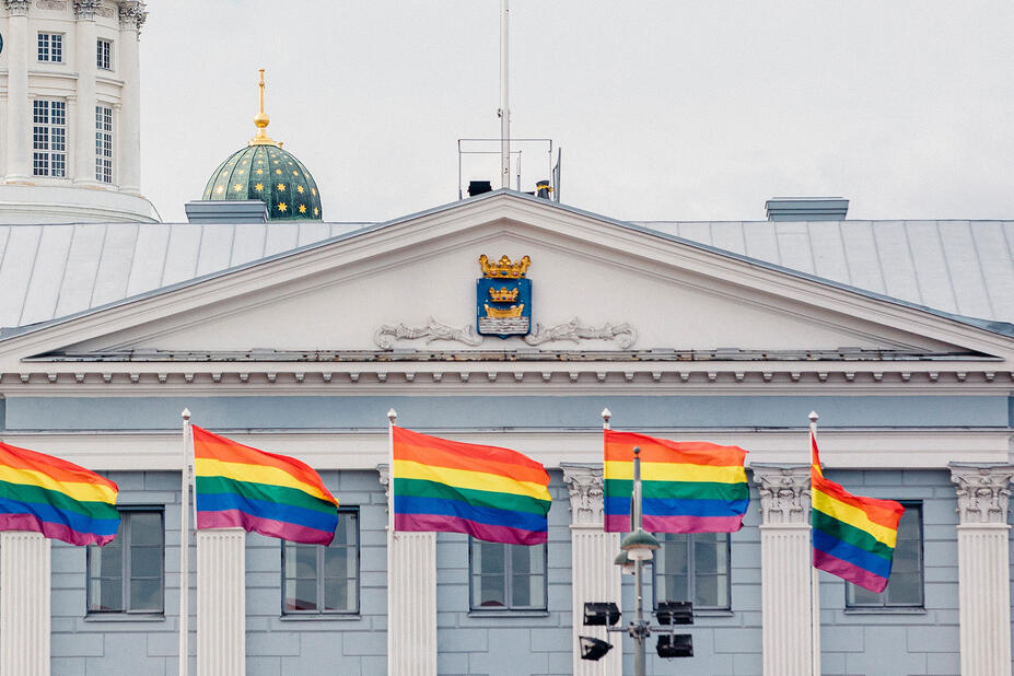
The Helsinki framed logo (link in Finnish) has replaced the traditional coat of arms in many ways. The City’s coat of arms is used during ceremonial contexts, such as:
- state visits
- the City’s anniversaries
- the City’s seal
- the central administration’s stamp
- the logo in Helsinki medals and diplomas.
Private individuals, associations, companies and other communities in Helsinki may use the coat of arms in their flag, membership pins or products, for example. In these contexts, the City’s coat of arms must be used with respect and according to the City’s guidelines and principles of heraldry. The City’s coat of arms and the Helsinki framed logo are never used together.
Guidelines on the City’s coat of arms (in Finnish)(Link leads to external service)
Fonts
City of Helsinki has two official fonts in use. Helsinki Grotesk (Helsinki Grotesk Pro from 2025 onwards) is a paid font customised for Helsinki. And an alternative font is Arial, which is found in each work station. No other fonts or hand-written text-like illustrations are allowed.
Helsinki Grotesk Pro for visual professionals
The sans-serif font has been tailored to Helsinki and is paid (licenced). Its design has a clear link to the arches and wave motifs of the framed logo. The font has five styles: Light, Regular, Medium, Bold and Black, in addition to which each of these in italic cuts.(Link leads to external service) Texts may not be illustrated or used as part of illustrations.
You can use Helsinki Grotesk Pro -typeface for a lot of things but not all language versions produced by Helsinki. Exceptions to replace the fonts are as follows:
- Arial: Arabic texts
- Noto Sans font family: Chinese, Japanese and other language versions which are not supported by the other fonts
Arial for employees and Office applications
Arial is used e.g. by office applications, such as PowerPoint, Word and Excel. It has been installed in every work station. Helsinki Grotesk Pro (.otf, open type) does not function in Microsoft software.


- The font licences and their installation to the City’s work stations are managed by the DigiHelsinki for their own clients. Others in City of Helsinki as well as purchase agreement partners of Helsinki need to buy and licence the font for themselves.
- Get your licences for the Helsinki Grotesk Pro font (€70/style) from the creator’s website or by email from: hello@camelot-typefaces.com.(Link opens default mail program)

As part of the visual identity, texts are written in basic forms; use capital letters and lower case. Titles and other text may not normally be written in upper case letters.

Illustrating titles, words or text is not allowed. However, permission may be granted in individual cases if a text or a word is an integral part of the illustration and does not play a significant role in the application. Consult the City Executive Office’s brand and events unit or the City’s graphic design experts.

When editing text, remember adequate font size and colour contrast of the text in relation to the background in order to ensure readability. Light tones against a light or a white background are not readable. Either black or white text must always be used in signs. View good colour combinations here.
It is important to show the hierarchy between different elements for the sake of accessibility in an unambiguous way. The main title, subheadings, text body and captions must be clearly separated.
Headings
The point size of the heading font and line spacing must be the same. For example, if the font point size is 30 pt, the line spacing must also be 30 pt.
Body
The line spacing in body text must be 120%. Therefore, if the body is 10 pt, the line spacing must be 12 pt.

Colours
The colour palette consists of recognisable colours from the city’s urban landscape, such as Engel yellow, Metro orange and Bus blue. The total number of colours is 14. Other colours must not be used and new ones may not be created.
The colours have been defined for several colour systems:
- CMYK i.e. process colours for coated (C) and uncoated (U) paper for print products and printouts.
- Pantone i.e. spot colours for print products.
- RGB/HEX colours for digital applications to be viewed on screen.
- RAL colours for painted surfaces. It is not possible to accurately reproduce color tones within the RAL Classic color system for Copper, Fog, Engel and Suomenlinna colors. The RAL shades of these colors do not correspond to their true hues.
- Decals (in Finnish) from three manufacturers for glass, metal, plastic, painted and other similar surfaces.

Silver and Gold may be used for foil and metallic printing (Pantone).
The colour definitions for digital services have been compiled in a separate set of HDS guidelines(Link leads to external service).
Download the colour codes intended for professional Adobe software as ASE (Adobe Swatch Exchange) files (link in Finnish). You can import the colour definitions directly into the software. Ready-made colour palettes reduce the risk of incorrect use of colour codes.
Brick
Pantone 1797
CMYK 5,95,100,0
RGB 189,39,25
HEX #BD2719
RAL 3001

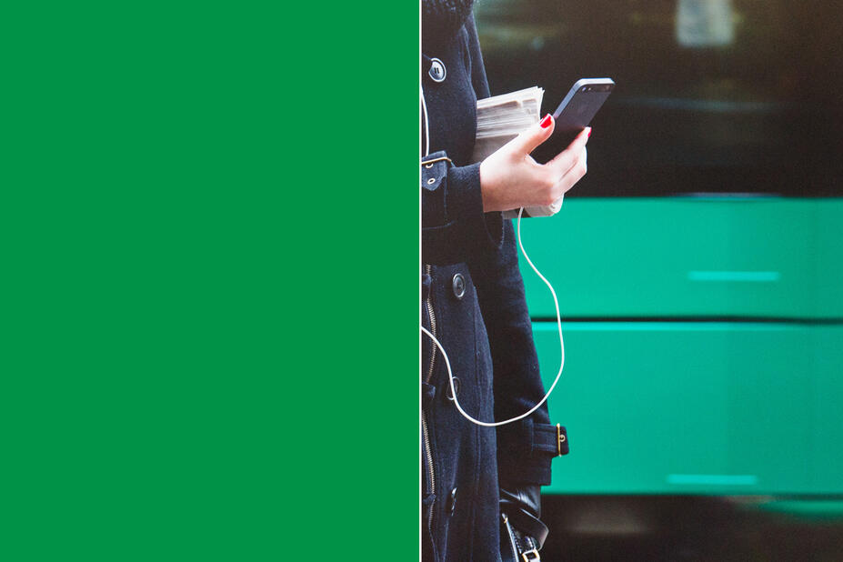
Tram
Pantone 355
CMYK 90,15,100,5
RGB 0, 135, 65
HEX #008741
RAL 6029
Copper
Pantone 3265
CMYK 65,0,50,0
RGB 0,215,167
HEX #00D7A7
RAL 5021 (does not correspond to the true color shade)

Metro
Pantone Orange 021
CMYK 0, 70, 100,0
RGB 253,79,0
HEX #FD4F00
RAL 2004

Fog
Pantone 277
CMYK 35,10,0,0
RGB 159,201,233
HEX #9FC9EB
RAL 5024 (does not correspond to the true color shade)

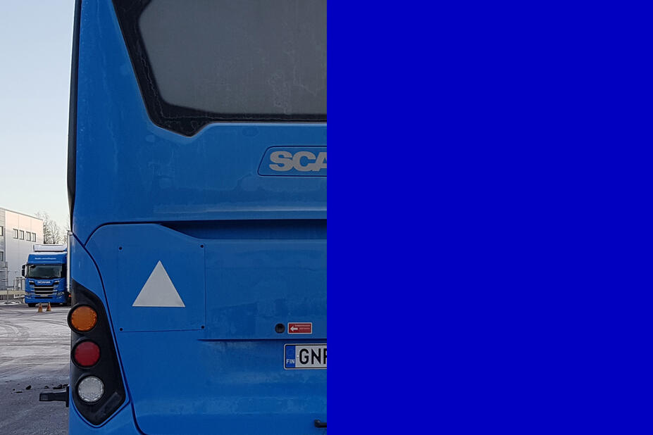
Bus
Pantone Blue 072
CMYK 100,100,0,0
RGB 0,0,191
HEX #0000BF
RAL 5002
Coat of Arms
Pantone 300
CMYK 98,50,0,0
RGB 0,114,198
HEX #0072C6
RAL 5005
Summer
Pantone 116 C
Pantone 114 U
CMYK 0,15,100,0
RGB 255,198,30
HEX #FFC61E
RAL 1021

Engel
Pantone 1205
CMYK 0,5,65,0
RGB 255,233,119
HEX #FFE977
RAL 1018 (does not correspond to the true color shade)
Suomenlinna
Pantone 203 C
Pantone 217 U
CMYK 0,45,0,0
RGB 245,163,199
HEX #F5A3C7
RAL 4003 (does not correspond to the true color shade)
NCS S 0530-R40B

Silver
Pantone 877
CMYK 15,10,10,20
RGB 222,223,225
HEX #DEDFE1
RAL 9022
Gold
Pantone 871
CMYK 10,30,75,15
RGB 194,162,81
HEX #C2A251
RAL 1036
White
Pantone White
CMYK 0,0,0,0
RGB 255,255,255
HEX #FFFFFF
RAL 9003
Black
Pantone Process Black
CMYK 0,0,0,100
RGB 0,0,0
HEX #000000
RAL 9017

The colour value of 100% must be used for all colours. Partial-intensity colours (percentages), gradients or translucency may not be used. The guidelines for using the framed logo against colour surfaces can be found here (in Finnish).

The table below is an illustration of the colour combinations that have sufficient contrast for your digital applications (such as Word files in PDF format, PowerPoint presentations, newsletters and social media posts). By using these colour combinations, you can ensure adequate contrast between the text and background. However, please remember that the readability of text also depends on the font size, line spacing and reading distance.

Decals are used for the following, for example:
- windows
- signage
- advertising boards
- vehicles.
Colour definitions have been chosen for Helsinki from amongst three manufacturers’ decals, namely Avery, 3M and Oracal. Decals are available for long- and short term use, and for straight and curved surfaces. Separate materials exist for indoor and outdoor use. The desired colour fastness duration in years must be taken into account when selecting decals.

Wave motifs
The wave motifs, inspired by Helsinki’s coat of arms, are used to divide surfaces. A wave is a design in which an edge is formed by a repeated pattern.
At their best, wave motifs can add stark contrast and desirable visual interest to an application. Select graphic elements to boost your message. The wave motifs have also been designed to serve as functional elements. They are a tool that you can use to create cohesion and harmony, or division, between different sections, to indicate things and to guide the recipient.
You should only use one motif per view.


Do not overuse motifs
Applications do not always require the use of a wave motif. Instead, you can create an interesting contrast by using other basic elements of the visual identity.
Other design solutions that comply with the visual identity include monocoloured surfaces without surface divisions, and photographs that cover an entire surface area, combined with carefully considered typography and a logo. Do not overuse the motifs.
There are a total of six wave motifs:
- Basic
- Calm
- Pulse
- Beat
- Vibration
- Wave

Always use the available original vector files of the wave motifs. You may not re-create or modify the motifs yourself. The wave motifs are also available in animated forms.
A grid that determines the positioning of elements has been created to help with the surface division. Surfaces can be divided either vertically, horizontally or diagonally. The same logic applies to different formats, such as vertical A4 and horizontal A4.
Wave motif angles
The wave motifs may only be used to divide a surface horizontally, vertically or at a 45 (135) degree angle.

Examples of surface division with the grid.

The waved motifs must include the following when used:
- At least two whole wave tips per surface.
- A wave should always be cut either at the tip or the bottom of the wave, i.e. half way between the highest or the lowest point of the motif.

Layout
The layout process links the various elements of the visual identity together. Designers should consider the use of empty space, text hierarchy, combinations of font sizes, and coloured, photographic and illustrated surfaces in order to create a powerful visual appearance.
- The template hierarchy will help you design any surface and decide on the correlation between different elements.
- Arrange your elements in a bold and spacious way.
- The preferred approach is to align the visual elements left.

- Empty space is necessary because it directs the viewer’s attention to the visual elements of a layout.
- Empty space does not need to be white. It can also be a colour background or a calm area in a photograph.
- It is better to use too few visual elements or text paragraphs on a page rather than too many.

- Make your layouts clear and graphic. For example, large text against a strong background colour or a photograph will have a notable visual impact.


